ARENA 10 Year Anniversary
Client
Australian Renewable
Energy Agency
A Circular Concept
ARENA’s 10-year anniversary started with a logo (below) and a long list of very different achievements to celebrate. The challenge was to present all this wildly varying information in a way that was visually cohesive, but avoiding the usual ‘a street of houses with renewable energy’ approach (the client’s request).
We solved this problem by taking inspiration from the circles in their anniversary logo. This provided the perfect framing device for a series of vignettes. We were able to bookend both ends of the animation, tying the content back to the logo at the beginning and end, while including circular transitions and imagery throughout providing visual continuity.
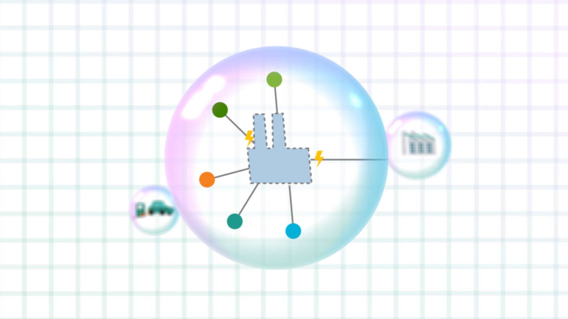
A List of Requirements
There was no getting around it. At one point in the animation, we had to read a long list of different technologies ARENA had invested in. There wasn’t enough time to do a distinct section for each one, but as the list was so long, we would struggle to keep the viewer’s attention while it was read out.
Again referencing the circles in the logo, we introduced the idea that each one represented a different project ARENA had worked on. We allowed the viewer to ‘fly’ into a 2D graph and explore these projects one by one in 3D space. Each project had a unique illustration and the fast-moving scene meant there was plenty of visual interest to keep the viewer’s attention.