Withdrawing Super Early Explainer
Client
Australian Institute of Superannuation Trustees
Purple Reigns
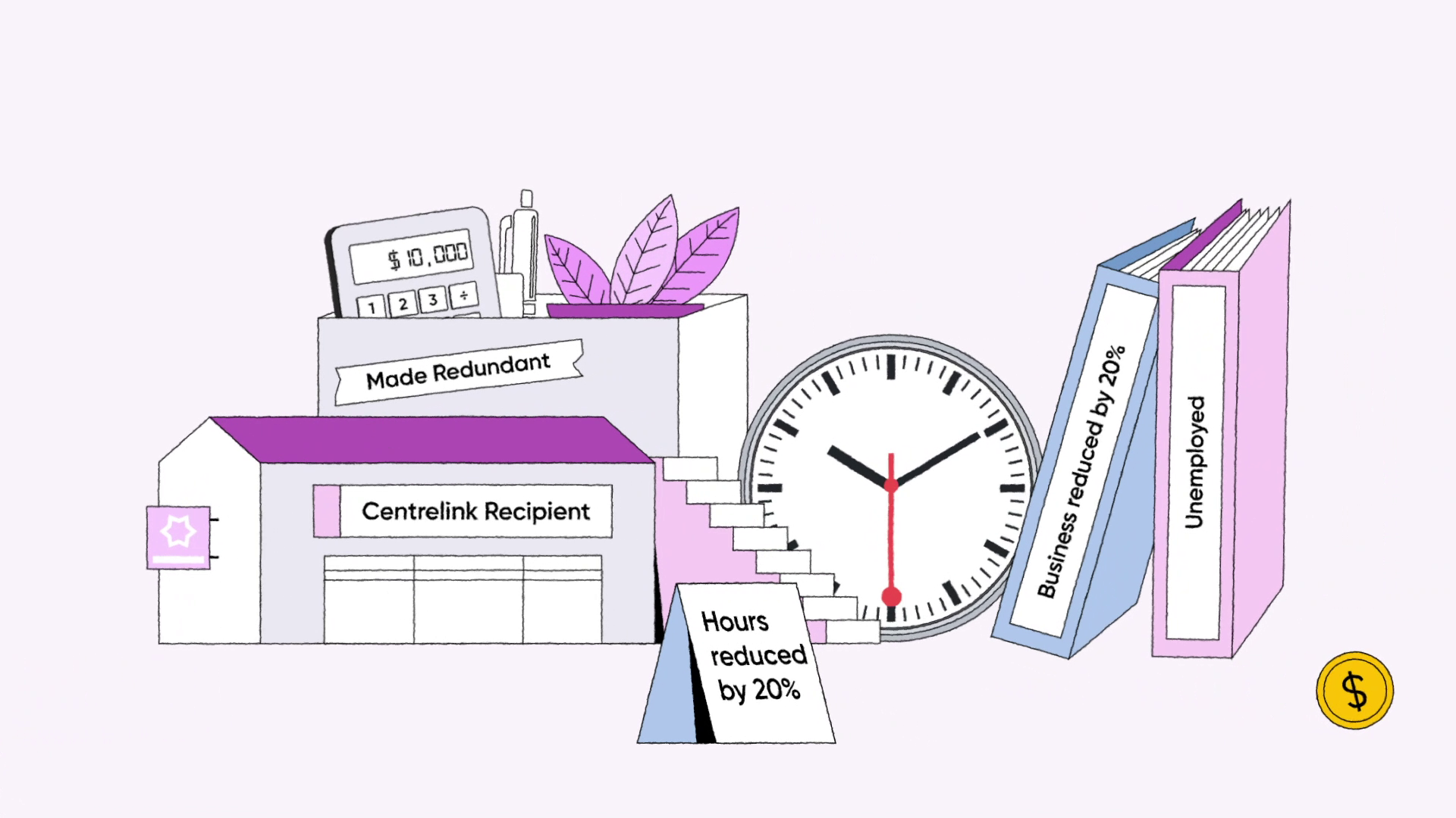
The brief specified a distinct purple colour scheme to be used throughout which would be utilised across all communication collateral for this campaign.
To make this work in reality, we added a few pops of blue and yellow to highlight various focal points that lead the viewer’s eye through the composition. The subtle black outlines of the illustration added a graphic quality that helped separate the similar colours from each other, as well as provide a subtly stylised look and feel.
Super Symbolism
How do you visualise an abstract concept like superannuation? Money in piggy banks is a literal answer but doesn’t take advantage of animations’ full potential. The solution had to make conceptual sense, and be easy to understand.
By using the visual metaphor of a tree that’s tended to, or not, over the years we were able to explore the effects on how much ‘fruit’ you end up with at the end. We were also able to introduce subtle references, like salmon turning into baked beans, houses into units and porches into bicycles in the background to further support the voiceover.